Cyberpunk 2077 glitch effect
Note: This post is about a motion intensive CSS animation. The examples will not work if
prefers-reduced-motionis set to reduce.
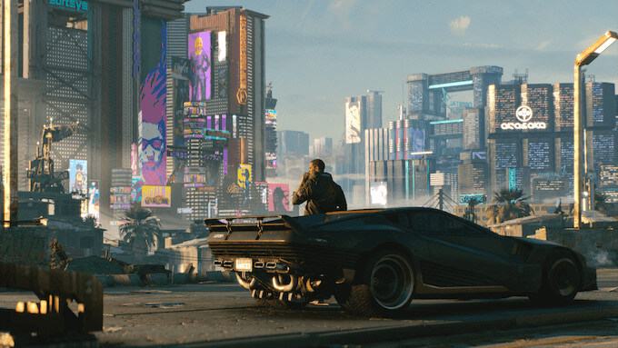
Cyberpunk 2077 is an impressive RPG game that was released these days (Dec. 2020).
It looks very good, it’s full of visual effects. Some of these visual effects, the glitch effects, appear a lot in the game (just to be clear,
because the game had lots of bugs when was released, I’m not talking here about game issues, about game glitches, but about the glitch visual effects)
I’ve found one of the glitch effects done in CSS and I was very intrigued by the implementation. Here is the effect in action:
 Animation blocked because you prefer reduced motion.
Very nice. So appropriate for a world in which humans survive by enhancing their body with hardware implants. Hardware that fails or that can be hacked, bought on the black market from shady individuals.
But how is this implemented in CSS?
Implementation
The trick is to use the same image twice. First as a normal image and secondly as an animated overlay from which parts are cut out and rotated.
We need a container with the relative position in which to put the overlay which will have an absolute position. Also inside the container, we put the image on which we’ll apply the effect:
<div class="container">
  <img src="/cyberpunk.jpg" alt="Cyberpunk" />
  <span class="overlay"> </span>
</div>
Here is the CSS (without the actual animation code).
.container {
  max-width: 100%;
  position: relative;
  overflow: hidden;
}

.overlay {
  display: block;
  animation-duration: 2s;
  animation-timing-function: linear;
  animation-iteration-count: infinite;
  animation-name: glitch;
  animation-direction: alternate;
  background-image: url("/cyberpunk.jpg");
  transform: rotate(-2deg);
  position: absolute;
  top: 0;
  left: 0;
  width: 100%;
  height: 100%;
  background-size: 100%;
  background-position: top;
  background-repeat: no-repeat;
}
- The container position is relative and hides the content that overflows.
- The overlay has an absolute position. Uses as background the same image like the one put inside the container.
- The overlay animation takes 2 seconds, is repeated forever, uses a linear easing, and animation direction alternates
The animation code will be presented later, first, we need to understand how it works.
No background image
Let’s see how the effect works if we hide the image (and replace it with yellow color).
Now it should be more clear how the overlay cuts pieces from itself.
Animation blocked because you prefer reduced motion.
The cutting is realized using a CSS property called clip-path. The value can be many things like a circle, an SVG path, or a polygon.
In our case, a polygon is used to create the clip-path. (Take a look here if you want to see how to create clip-path polygons.)
The polygon needs the placing of its points:
.cut {
  clip-path: polygon(0 78%, 100% 78%, 100% 100%, 0 100%);
}
To achieve the full effect, these clippings are moved and rotated a bit:
.moved-rotated {
  transform: translate(5px) rotate(-2deg);
}
No overlay image
Here we replace the overlay’s image with a color.
Animation blocked because you prefer reduced motion.
As you can see the effect can be used with colors only (I’m pretty sure I’ve seen this somewhere.) The advantage of this version is that we don’t have to use the image twice, and so it can simplify the code a bit.
Slow motion
And finally, here is the animation in slow motion (10x slower).
Now it’s clearer that the animation runs first from the start and the second time from the end, it alternates the starting point. This is set by animation-direction: alternate
Animation blocked because you prefer reduced motion.
Most of the steps are displayed for at least a second, except for 4 steps. 3 are much faster (see below steps 13.1%, 20.1%, and 60.1%).
The last step is the slowest and takes about 40% of the animation duration. And because the second time the animation starts from the end, the gap when nothing happens appears to be very big.
Animation code
Finally here is the animation code, as I found it on cyberpunk.net. I assume they somehow exported it from the game assets (I’ve never seen before 13.1% or 20.1% used as keyframes before).
@keyframes glitch {
  0% {
    opacity: 1;
    transform: translateZ(0) rotate(-2deg);
    clip-path: polygon(0 2%, 100% 2%, 100% 5%, 0 5%);
  }
  2% {
    clip-path: polygon(0 78%, 100% 78%, 100% 100%, 0 100%);
    transform: translate(-5px) rotate(-2deg);
  }
  6% {
    clip-path: polygon(0 78%, 100% 78%, 100% 100%, 0 100%);
    transform: translate(5px) rotate(-2deg);
  }
  8% {
    clip-path: polygon(0 78%, 100% 78%, 100% 100%, 0 100%);
    transform: translate(-5px) rotate(-2deg);
  }
  9% {
    clip-path: polygon(0 78%, 100% 78%, 100% 100%, 0 100%);
    transform: translate(0) rotate(-2deg);
  }
  10% {
    clip-path: polygon(0 54%, 100% 54%, 100% 44%, 0 44%);
    transform: translate3d(5px, 0, 0) rotate(-2deg);
  }
  13% {
    clip-path: polygon(0 54%, 100% 54%, 100% 44%, 0 44%);
    transform: translateZ(0) rotate(-2deg);
  }
  13.1% {
    clip-path: polygon(0 0, 0 0, 0 0, 0 0);
    transform: translate3d(5px, 0, 0) rotate(-2deg);
  }
  15% {
    clip-path: polygon(0 60%, 100% 60%, 100% 40%, 0 40%);
    transform: translate3d(5px, 0, 0) rotate(-2deg);
  }
  20% {
    clip-path: polygon(0 60%, 100% 60%, 100% 40%, 0 40%);
    transform: translate3d(-5px, 0, 0) rotate(-2deg);
  }
  20.1% {
    clip-path: polygon(0 0, 0 0, 0 0, 0 0);
    transform: translate3d(5px, 0, 0) rotate(-2deg);
  }
  25% {
    clip-path: polygon(0 85%, 100% 85%, 100% 40%, 0 40%);
    transform: translate3d(5px, 0, 0) rotate(-2deg);
  }
  30% {
    clip-path: polygon(0 85%, 100% 85%, 100% 40%, 0 40%);
    transform: translate3d(-5px, 0, 0) rotate(-2deg);
  }
  30.1% {
    clip-path: polygon(0 0, 0 0, 0 0, 0 0) rotate(-2deg);
  }
  35% {
    clip-path: polygon(0 63%, 100% 63%, 100% 80%, 0 80%);
    transform: translate(-5px) rotate(-2deg);
  }
  40% {
    clip-path: polygon(0 63%, 100% 63%, 100% 80%, 0 80%);
    transform: translate(5px) rotate(-2deg);
  }
  45% {
    clip-path: polygon(0 63%, 100% 63%, 100% 80%, 0 80%);
    transform: translate(-5px) rotate(-2deg);
  }
  50% {
    clip-path: polygon(0 63%, 100% 63%, 100% 80%, 0 80%);
    transform: translate(0) rotate(-2deg);
  }
  55% {
    clip-path: polygon(0 10%, 100% 10%, 100% 0, 0 0);
    transform: translate3d(5px, 0, 0) rotate(-2deg);
  }
  60% {
    clip-path: polygon(0 10%, 100% 10%, 100% 0, 0 0);
    transform: translateZ(0) rotate(-2deg);
    opacity: 1;
  }
  60.1% {
    clip-path: polygon(0 0, 0 0, 0 0, 0 0);
    opacity: 1;
  }
  to {
    clip-path: polygon(0 0, 0 0, 0 0, 0 0);
    opacity: 1;
  }
}
Post Scriptum
I’ve used MDX and CSS modules to implement this blog post.
That way I was able to create a React component, Glitch that could be used inside markdown, with its own
CSS and HTML. MDX is incredibly useful, if you’re using React (with Gatsby or Next.js) I highly recommend it.